IntegralUI TreeListView for .NET WinForms
Rich multi-column hierarchical data visualization control
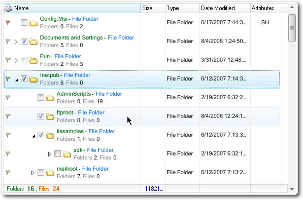

Custom Multi-Column TreeView
Fast Data Load and Update
Embed Any Control as Editor
Serialization to XML
Multiple Visual Styles and Themes
Why Choose?

Improve Productivity with High Performance Control
You can load thousands of nodes just in few miliseconds, no matter whether your data is stored in database or you create your own data source.
Reduce your Development Time and Costs
Most of the features you may need in your application are already built-in. Check out our complete feature list from link below.
Modern Look of Your Applications
It is critical for your application to have modern look and feel. Enhance your applications by using already built-in themes or create your own custom color schemes to change every part of the control individually.
Fast and Dedicated support
Don't hesitate to contact our support team. Your questions will be answered promptly and you will receive solution ASAP, no matter how difficult the problem is.
We use the IntegralUI TreeListView extensively in applications developed for many clients. We are highly satisfied with the product and cannot say enough about it. This product merges the best features of the .net TreeView and ListView, enabling the rapid development of very powerful interfaces that allow end users to navigate data and view relevant details when necessary.
Michael Sweet
President
Fidelis Partners, Inc.