IntegralUI TreeView for .NET WinForms
Rich hierarchical data visualization control

Highly Customizable Appearance
Advanced Drag and Drop
Custom Sorting and Filtering
Rich Content
Themes
Why Choose?

The Most Advanced TreeView .NET Control on the Market
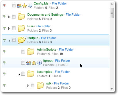
IntegralUI TreeView comes with many advanced features like fully customizable appearance, improved drag and drop functionality, custom filters, sorting, unique ability to arrange text, images, hyperlinks in every node and to embed any controls and arrange them in custom layouts and much more.
Improve Productivity with High Performance Control
You can load thousands of nodes just in few miliseconds, no matter whether your data is stored in database or other custom data source.
Cut Your Development Costs
Most of the features you may need in your application are already built-in. Check out our complete feature list from link below.
Modern Look of Your Applications
It is critical for your application to have modern look and feel. Enhance your applications by using already built-in themes or create your own custom color schemes to change every part of the control individually.
Fast and Dedicated support
Don't hesitate to contact our support team. Your questions will be answered promptly and you will receive solution ASAP, no matter how difficult the problem is.
I have been using the IntegralUI TreeView for a few years now; it was the best single Windows Forms control for .NET I have ever seen, when I started using it, and now, a few versions later, it is even more full-featured!.
Bill Woodruff