Dynamic Styling in Blazor Grid
In general, you can change the Grid appearance by using custom CSS properties targeting specific component part. However, this change is static, by creating a CSS file with custom properties set. In many cases, you may need to change the appearance dynamically when specific event or data change happens. For this purpose, dynamic styles come into place. In this document you will learn how to create multiple CSS styles on demand, targeting specific grid cells based on data changes.
If you have any questions, don't hesitate to contact us at support@lidorsystems.com
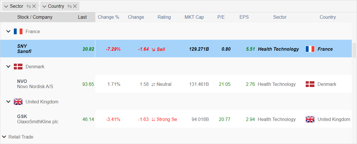
This sample demonstrates fast updates of Grid data in combination of style changes. Depending on cell value, the text color changes to red, green or blue, based on dynamic styles set in code. If specified condition is fulfilled, the style is applied. You can apply styles to Columns, Rows, Cells or the Grid component.
Data updates are asynchronously applied and they don't interrupt user interactions. You can scroll the grid freely or take other actions like column resize etc.
How to Create Dynamic Styles in Blazor Grid
To create a CSS style in code, you need to set the Styles tag as part of Grid HTML. Under this section you can add multiple styles, each one with different settings. Each style can have the following:
- TargetType - specifies the component part to which the style is applied
- Condition - specifies custom action method that determines when the style is applied
- State - specifies the state when the style is applied: Normal, Hovered, selected, Disabled or All
- Value - a value used to create a custom condition
- CSS Attributes - a set of different CSS attributes that creates the CSS inline style
You can apply multiple different styles to the same component part, using different conditions. The order of the style set in HTML is important, where the last style overrides the previous one when the target and conditions are the same. In this way, you can have multiple styles overlapping and targeting the same object, but will execute on different state or when condition is fulfilled.
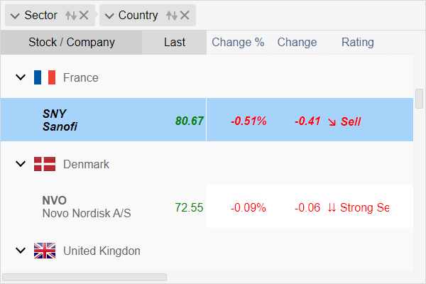
Rows in Alternate Colors
Here is an example of dynamic style that changes the background color of grid rows based on their index. As a result grid rows appear in alternate colors:
In this example, the ConditionIndex property is used to assign a custom action method that will check the index of each grid row. If the index is an odd number, the style is applied.
Different Target Types
In case of Blazor Grid, the TargetType can be one of the following:
- Cell - target is the grid cell
- Column - target is the grid column
- Component - the Grid component
- Footer - targets the column footer
- Group - targets a row that is a group header
- Header - targets the column header
- Row - target is the grid row
- Summary - targets a row that is a group summary
The TargetType property states that the style is applied to specific part of the Blazor Grid component. This includes all objects of the same type, for example for Row type it means all grid rows. To specify which specific row(s) will have the style applied, you need to create a condition.
How to Create Style Condition
You can create a custom condition that will determine whether the style is applied, by using one of the following properties:
- Condition - an action method based on target object
bool methodName(object? obj)- ConditionIndex - an action method based on target object and its index
bool indexMethodName(object? Obj, int index)- ConditionValue - an action method based on target object and provided style value
bool valueMethodName(object? Obj, object? value)
All these methods return a Boolean value, true when condition is fulfilled, otherwise false. Only when this value is true, the style is applied to the target object type.
Here is an example of a condition where grid cells change their text color to red, depending on cell value type and when value is below zero.
Different Object States
By default, dynamic styles are applied when object is in Normal state. This means, when object is not hovered, not selected nor disabled, this is a default object state.
The following states are possible:
- Normal - when object is in default state without any modifications
- Hovered - when object is hovered
- Selected - when object is selected
- Disabled - when object is disabled
- All - all above states
An object can have one or multiple states at the same time. For example, an object can be Hovered and Selected. The State property accepts bitwise values, so you can apply multiple states at the same time.
Here is an example of a dynamic style that is applied only when grid row is selected. The text will appear in bold and italic font style:
Style Value
The Value property allows you to set up a custom value that you will use to create the condition. Based on this value and the target object, you can determine whether the style is applied or not, within a condition set using the ConditionValue method.
Available CSS Attributes
Only small part of CSS attributes is available to create a custom CSS inline style. Here is a attribute list split in categories:
Appearance
- Background
- Border
- BorderColor
- BoxShadow
- Color
- Opacity
Font
- Font
- FontSize
- FontStyle
- FontWeight
General
- Cursor
Layout
- Margin
- MaxHeight
- MaxWidth
- Padding
Position
- Bottom
- Left
- Position
- Top
- Right
These are standard CSS attributes that you can use to create an inline CSS style. In combination with previously set target type, condition and state, the style is applied during run-time.
Depending on target type, some of these attributes will not have any effect. In general, you can use them to alternate the Grid appearance on demand.
Conclusion
Dynamic styling in Blazor Grid component allows you to create CSS styles that are applied during run-time when specific conditions are met. You can target a specific part of the component, that you want to change based on some event or condition set in your code. This allows you to modify the Grid appearance on demand.
IntegralUI for Blazor is a library of native Blazor components that includes the Grid Component. You can use it to develop web apps in Blazor .NET framework.