Edit Form in Blazor Grid
IntegralUI Grid component for Blazor .NET includes a built-in edit Form that you can use each row separately. The edit form is constructed based on columns that allow editing and the editor type in use by each column. In this document, you will learn how to activate the edit form and modify the fields of each row displayed in the Blazor Grid.
If you have any questions, don't hesitate to contact us at support@lidorsystems.com
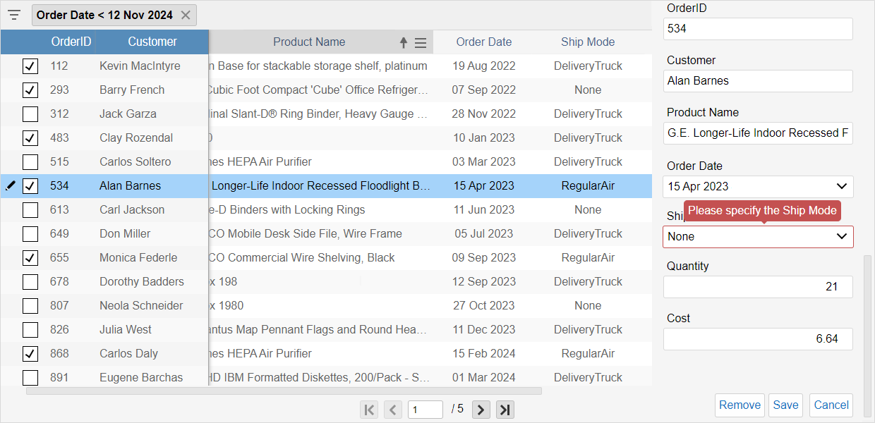
To activate the editing form, left-click on or touch the Pencil icon displayed in the first column when row is hovered. In addition, you can activate the edit form also by double-click a row. A resizable form will appear on the grid right side showing all editable fields with a corresponding editor based on column editor type
When Edit Form is active, you can:
- make changes to row values using different editors
- save the form data by clicking on the Save button
- cancel any changes by clicking on the Cancel button
- remove the row from the Grid
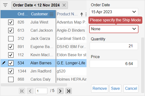
Input Form Validation is also active. Whenever a value is entered in editors, a data validation rule will determine whether data is valid or not. For invalid fields, the editor will appear with red outline and when focused a message will popup stating the reason.
How to Edit Data with Form in Blazor Grid
One way to edit grid data is using a Form. Whenever a row enters in edit mode, a form will appear on the right side of the Grid showing all editable cells. There are several editors that can appear in the Form: CheckBox, DatePicker, DropDown List, Numeric, ProgressBar, Rating, Slider and Text.
By default, editing is disabled in the IntegralUI Grid. To starting editing, you need to do the following:
- Set the EditMode property to Form
- Choose one of available built-in editors by setting the EditorType property for columns
- (Optional) Set the UseValidation to activate input validation rules, if set in your code
- (Optional) Set one or more validation rules that you will use for data input validation
How to Activate the Edit Form
By doing above steps, the Grid will show a column fixed on left side that will display a Pencil icon when hovering over a row. When you click on this icon, the Edit Form will appear on the right side.
If column doesn't have EditorType set, the corresponding field will not appear in the Editing Form. In addition, records that have AllowEdit property set to false, are not editable and they cannot appear in the Form.
There are other ways to activate the edit form, by handling events that will trigger form activation by calling the BeginEdit method in your code. For this purpose, for example you can handle the RowClick or RowDblClick events or activate the form by clicking on a button outside of the Grid. A call to BeginEdit method will start the editing process for specified row, while calling the EndEdit can save or cancel any data changes.
For example, to show the edit form and start editing when row is double-clicked you can use this code:
When Form is active, you can edit only one row at time. If you click on pencil button in a different row, changes to previous editing row are cancelled and the form resets showing values from the newly selected row. Clicking again on the Pencil icon, will close the editor.
Available Editor Types
To determine what kind of editor you will use in the Form for specific field, you need to set EditorType property for columns to a specific editor. You can choose one of these editors:
- CheckBox - for editing Boolean values
- Date - for editing Date values
- DropDownList - for choosing an option from a list
- Numeric - for editing numbers using a text box
- Progress - will display a Slider to edit progress values
- Rating - for editing ratings
- Slider - for editing numeric values using a slider
- Text - for editing string values
Here is an example of using the DatePicker editor:
When edit form is active, a DatePicker editor will appear for corresponding field. When left-click on or touch the editor a dropdown Calendar will appear from where you can choose a new date. If input data validation is active, based on rules set in your code, it will check whether the new date value is within the acceptable range. If not, the DatePicker will appear in red outline and rule message will popup stating the reason. If new date is valid, you can continue with editing other fields.
Save Form Data
Once you are finished with editing, you can click the Save button at the end of the Edit Form. This will confirm any changes and save the row in the grid with new values. If you click on Cancel button within the Form, all changes to the row are cancelled. In both ways, the form will close and pencil icon will disappear from the first column in editing row, representing that row is back in non-editable normal state.
Remove Grid Row from Editing Form
There is one additional button at the end of the edit form that allows you to discard any changes and delete the row from the Grid. The Remove button will appear only if AllowRemove property of the Blazor Grid component is set to true. Otherwise by setting this property to false, you can prevent row removal.
Data Change Events in Blazor Grid
When using the Edit Form any data changes are not applied until the Save button is clicked or EndEdit method is called. Data saving is accompanied with these events:
- DataChanging - occurs before data changes to specified row are confirmed
- DataChanged - occurs after data changes are confirmed
- DataInvalid - occurs when data contains some fields with invalid values
These events carry the original and modified data fields. In addition, DataChanging event also contains a Cancel field that you can use to discard any data changes, by setting it to true.
By handling these events in your code, you can review any changes to the data and cancel or proceed with saving. For example, by handling the DataChanged event you can update fields that are not editable, when their value is composed from other fields. In this example, the Total value is based on changes to the Quantity and Price values:
Handling the DataInvalid event when occurs is mostly used to inspect which modified data values are invalid and notify the user with a custom message stating the reason. Here is an example:
Conclusion
Edit Form in Blazor Grid component allows you to edit rows one by one. This form is automatically generated with editors for all editable fields for a specific row. Editors that are shown in the editing form are selected based on specified column editor type, for each column separately. To activate the edit form, you can use mouse/touch or do it manually from code. During editing, data change events are fired, which you can handle in your code, where you can confirm or discard the changes.
A sample code is available in C# that shows you how to set up the content of the editing Form and handle events that accompanies the edit process. The Grid is a native Blazor Component, part of IntegralUI for Blazor that you can use to develop web applications in any Blazor .NET framework.