Multi-Line Header in Blazor Grid
By default, the Grid will display columns with headers in just one line. However, in some cases you may need to display additional information in column header in multiple lines, like a title and subtitle. IntegralUI Grid component for Blazor .NET has a feature where each column can contain child columns. This allows you to create multi-line header where each column can have its own title or custom HTML content.
If you have any questions, don't hesitate to contact us at support@lidorsystems.com
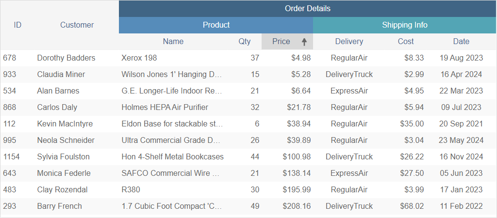
This example shows a Grid with order details. Some columns have only one header, while the 'Order Details' column contains child columns, three header levels in total. There are two child columns 'Product' and 'Shipping Info' with their own child columns, where each column shows a separate title.
How to Create Multi-Line Header in Blazor Grid
To create a column with multi-line header in Blazor Grid component is simple. Each column object has Columns property that holds a reference to child column objects. There is no level limit in this column tree hierarchy, you can have as many parent and child columns as you need.
The column object for parent and child columns is the same. You can set different properties for each column individually, like: data binding, alignment, width, data formatting, filter etc. In addition, you can attach an editor for each column, which can be a built-in editor or you can create your own custom editor in column's header template.
Columns are created using the IntegralUIGridColumn component within HTML. To add child columns, under the Columns tag you can add additional child columns using the same component. Here is an example:
You can also create parent-child columns structure directly in code, using the DataColumns property. More information is available here: Column Definition.
In this example, the "Order Details" column contains two child columns: "Product" and "Shipping Info". These columns have their own child columns, with more detailed settings, because they are the end level of the hierarchy where you set the data binding and formatting, using the Field and FormatSpecifier properties.
To bind data to the Grid component is only required for the end level columns, the parent columns are not required to have any data binding.
As an example, the "Shipping Info" column is contained within the "Order Details" column and has three children:
- "Delivery" column - displays a value based on DeliveryOptions enumeration
- "Cost" column - displays numeric values in each cell
- "Date" column - it displays DateTime values in specified date format
All of these columns have their header title and content aligned to appear in center of the cell, only the 'Cost' column has its content aligned on the right side.
Depending on parent-child structure of column objects, internally the Blazor Grid component arranges the column layout and displays their headers in multiple lines. The maximum header level is determined by the number of levels of column tree hierarchy. The space for all other columns with fewer child columns is adjusted accordingly.
Resizing a child column will also resize all parent columns, and vice versa.
Grid Header Title in Multiple Lines
Contrary to showing columns with headers in multiple levels, in some cases when you have a long header title, it can be shown with trimming at the end by default, or you can choose to show it in multiple lines.
How to Change Column Header with CSS
Initially, the Grid is set so that each column header title is displayed in one line. You can change this in CSS by following these steps:
- Add an id attribute to the Grid component using the Id property
- Use the id value to create a CSS selector
- Change the value of --iui-grid-column-header-white-space CSS variable to normal
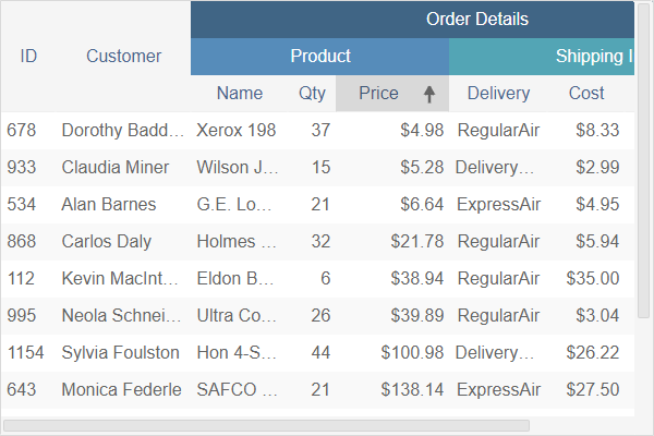
In this way, during resize when column header can’t display a longer title in one line, it will wrap the title in multiple lines.
How to Create Custom Header in Multiple Lines
The other way is to create a header template, where you can customize the header title. For each column, you can create header with title or subtitle, or completely customize it by adding your own HTML content using other Blazor components.
For this purpose, within HeaderTemplate in HTML, add your content. You can also setup conditions here, in case you need to alternate the content for specific headers using the Field property or other unique identifiers.
Conclusion
IntegralUI Grid component for Blazor .NET allows you to create columns with multi-line headers or headers where long titles can appear in multiple lines. You can create a tree hierarchy of multiple levels or parent-child columns, where each column can have its own settings and customization.
Grid is a native Blazor Component, part of IntegralUI for Blazor library that you can use in Blazor .NET framework.