IntegralUI ListView for .NET WinForms
Rich data visualization in multiple views

Display Data in Five Views
Advanced Drag and Drop
Custom Sorting and Filtering
Serialization to XML
Modern Look and Feel
Why Choose?

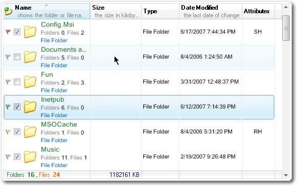
Display Your Data in Multiple Views
IntegralUI ListView comes with many different views to arrange your data. Its unique ability gives you opportunity to arrange text, images, hyperlinks and to embed any controls and arrange them in custom layouts in each column, item or subitem.
Cut Your Development Costs
Most of the features you may need in your application are already built-in. Check out our complete feature list from link below.
Moder Look of Your Applications
It is critical for your application to have modern look and feel. Enhance your applications by using already built-in themes or create your own custom color schemes to change every part of the control individually.
Fast and Dedicated support
Don't hesitate to contact our support team. Your questions will be answered promptly and you will receive solution ASAP, no matter how difficult the problem is.
Lidor Systems makes working with third-party components a pleasure. Their products offered me the combination of functionality and lightweight footprint that was perfect for my application. Better yet, they provide a level of depth and responsiveness in their support that is unmatched.
Tod Golding