Splitter with Expand/Collapse Buttons
Created: 16 August 2013
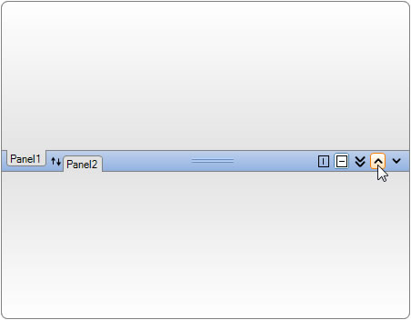
SplitContainer is a useful control when you need to split content in two panels and resize them using a splitter. By default the splitter doesn’t contain any buttons and only functionality available is to change its position which will resize divided panels. IntegralUI SplitContainer extends that functionality by presenting each panel with a tab header and command buttons inside splitter with custom functionality.
By default splitter contains three buttons: two for changing the orientation of divided panels from horizontal to vertical and also a button to expand or collapse the first panel. However, there may be cases when you want to create and add your own custom button with custom functionality. In following text we will present you how to do that.
How to Create Expand/Collapse Buttons in Splitter
The IntegralUI SplitContainer has a TabStripButtons property which holds a collection of all buttons that are added to the container control and which are visible inside splitter space. When creating a new button we will also need a visual representation of it by assigning an image. This can be done in two ways either from control designer or programmatically through code:
- by using an ImageList to create a set of images
- by using a single image
In first way, each button has an ImageIndex property which points to designated image inside ImageList collection of images. In order this to work; the control ButtonImageList property must points to the selected ImageList. In second way we are using the Image property of button and assign an already created image from a file or from other resource.
// Assign an ImageList to ButtonImageList property so images can be accessible for buttons
this.splitContainer1.ButtonImageList = this.imageList1;
// Create a new command button
LidorSystems.IntegralUI.Controls.CommandButton cmdButton = new LidorSystems.IntegralUI.Controls.CommandButton();
// Assign a value which points to an image in ImageList already added to the ButtoImageList property
cmdButton.ImageIndex = 2;
// Assign an image from a file
cmdButton.Image = Image.FromFile("custom-image.jpg");
// Add the command button to the SplitContainer
this.splitContainer1.TabStripButtons.Add(cmdButton);
' Assign an ImageList to ButtonImageList property so images can be accessible for buttons
Me.splitContainer1.ButtonImageList = Me.imageList1
' Create a new command button
Dim cmdButton As New LidorSystems.IntegralUI.Controls.CommandButton()
' Assign a value which points to an image in ImageList already added to the ButtoImageList property
cmdButton.ImageIndex = 2
' Assign an image from a file
cmdButton.Image = Image.FromFile("custom-image.jpg")
' Add the command button to the SplitContainer
Me.splitContainer1.TabStripButtons.Add(cmdButton)
Now we have a command button which is display inside splitter space. There is no limit on how many buttons can be created and added as long there is enough visible space inside the splitter to show all buttons. If there is no space, some buttons will become hidden.
By default no operation will be executed when a button is clicked. In order to create one, we need to handle the TabStripButtonClicked event. This event is fired whenever a command buttons is clicked. For purpose of this writing we will create two buttons, one will expand the first panel and collapse the other, and the second button will collapse the first panel and expand the other.
To distinct the buttons from each other, we are using their Key property to store a unique value which will help us to identify on which button a click was made.
private void splitContainer1_TabStripButtonClicked(object sender, LidorSystems.IntegralUI.ObjectClickEventArgs e)
{
if (e.Object is LidorSystems.IntegralUI.Controls.CommandButton)
{
LidorSystems.IntegralUI.Controls.CommandButton cmdButton = (LidorSystems.IntegralUI.Controls.CommandButton)e.Object;
switch (cmdButton.Key)
{
case "EXPAND_UP":
this.splitContainer1.Panel1Collapsed = true;
break;
case "EXPAND_DOWN":
this.splitContainer1.Panel2Collapsed = true;
break;
}
}
}
Private Sub splitContainer1_TabStripButtonClicked(ByVal sender As Object, ByVal e As LidorSystems.IntegralUI.ObjectClickEventArgs) Handles splitContainer1.TabStripButtonClicked
If TypeOf e.[Object] Is LidorSystems.IntegralUI.Controls.CommandButton Then
Dim cmdButton As LidorSystems.IntegralUI.Controls.CommandButton = DirectCast(e.[Object], LidorSystems.IntegralUI.Controls.CommandButton)
Select Case cmdButton.Key
Case "EXPAND_UP"
Me.splitContainer1.Panel1Collapsed = True
Exit Select
Case "EXPAND_DOWN"
Me.splitContainer1.Panel2Collapsed = True
Exit Select
End Select
End If
End Sub
How to Change Splitter Orientation from Clicks on Command Buttons
Initially, the splitter is positioned horizontally and divides panels on top and bottom one. There is already a built-in button added to the splitter which when clicked will change the splitter orientation from horizontal to vertical or vice versa. However, during this change, any custom button added to the splitter will remain with the same visual representation. In some cases this may not look good, because it will give different meaning to button functionality.
To solve this we can handle the OrientationChanged event and use different images for some buttons if needed depending on current splitter orientaton.
private void splitContainer1_OrientationChanged(object sender, EventArgs e)
{
switch (this.splitContainer1.Orientation)
{
case Orientation.Horizontal:
this.splitContainer1.TabStripButtons[3].ImageIndex = 0;
this.splitContainer1.TabStripButtons[4].ImageIndex = 1;
break;
case Orientation.Vertical:
this.splitContainer1.TabStripButtons[3].ImageIndex = 2;
this.splitContainer1.TabStripButtons[4].ImageIndex = 3;
break;
}
}
Private Sub splitContainer1_OrientationChanged(ByVal sender As Object, ByVal e As EventArgs) Handles splitContainer1.OrientationChanged
Select Case Me.splitContainer1.Orientation
Case Orientation.Horizontal
Me.splitContainer1.TabStripButtons(3).ImageIndex = 0
Me.splitContainer1.TabStripButtons(4).ImageIndex = 1
Exit Select
Case Orientation.Vertical
Me.splitContainer1.TabStripButtons(3).ImageIndex = 2
Me.splitContainer1.TabStripButtons(4).ImageIndex = 3
Exit Select
End Select
End Sub
In above code we are changing the appearance of fourth and fifth button to different images, depending on splitter orientation.
To see all this in action a sample in C# and VB is available for download from here: Splitter with Expand Collapse Buttons