Multi-Color Tabs in TabControl
Created: 20 September 2013
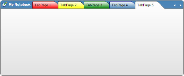
All tabs in TabControl in general have uniform look, all have the same colors and the only difference is when tab is hovered or selected. In some cases we may need to show some or all tabs in multiple colors, so the user can easily distinguish a specific tab.
Creation of a multi-color tabs is easy in IntegralUI TabControl. All tab pages have an individual set of color styles for each state of the tab: disabled, hovered, normal and selected. By default tabs inherits their appearance from color styles of its parent TabControl. To avoid this, at first we need to set the StyleFromParent property value for a specific tab page, to false. After that any changes to individual color styles of tab page will be applied to that specific tab. For example:
// Make sure tab page not uses the settings from its parent TabControl
page.StyleFromParent = false;
// Increase the space between tab border and its content
page.FormatStyle.Padding = new Padding(5);
// Change the colors of tab page when it is in normal state
page.NormalStyle.BackColor = Color.Red;
page.NormalStyle.BackFadeColor = Color.White;
page.NormalStyle.BorderColor = Color.DarkRed;
// Change the colors of tab page when it is hovered
page.HoverStyle.BackFadeColor = Color.White;
page.HoverStyle.BackColor = CommonMethods.ChangeColor(page.NormalStyle.BackColor, 35, true);
' Make sure tab page not uses the settings from its parent TabControl
page.StyleFromParent = False
' Increase the space between tab border and its content
page.FormatStyle.Padding = New Padding(5)
' Change the colors of tab page when it is in normal state
page.NormalStyle.BackColor = Color.Red
page.NormalStyle.BackFadeColor = Color.White
page.NormalStyle.BorderColor = Color.DarkRed
' Change the colors of tab page when it is hovered
page.HoverStyle.BackFadeColor = Color.White
page.HoverStyle.BackColor = CommonMethods.ChangeColor(page.NormalStyle.BackColor, 35, True)
In above code we are making changes to individual color and format styles for specific tab page. We are also using a built-in method ChangeColor, which changes some color to become lighter or darker. This is useful when we are not sure what exact color we want to apply, and we want to have the same color as in normal state but a little lighter or darker when tab is hovered.
By applying this to multiple tabs we can easily achieve an appearance similar to tabs in Microsoft OneNote application. To accommodate this we also need to add a label with image which will represent a title for opened tabs. The IntegralUI TabControl has a unique feature which allows you to combine toolbar and tabs in single line. To create a title, we can just simply add a label with an image which will always appear to the left before tabs.
The toolbar can accept different kind of tools: label, button, drop-down button and separator, and can also split tools to appear either to the left or right side of the tab strip with tabs shown in middle.
There is a sample project in C# and VB available for download from here: TabControl with Multi Color Tabs